This is a hands-on example of Random Forests in Python, to practice how to
handle most common tasks in using this popular ML algorithm in Python.
In principle, I will use scikit-learn, but let’s see how it goes and which
other libraries I have to throw into the mix.
Random Forests
This is my checklist to explain random forests (and sometimes advocate its use) to the non-initiated, trying to convey the intuition behind the algorithm but still using some of the jargon.
-
It is an ensemble learning algorithm
- Combines multiple models (ensemble) to come up with a prediction
- For the combination uses bagging strategy (bootstrap aggregating, many samples with replacement)
- Aims to combine multiple low-bias high variance models, so as to optimize the bias-variance trade-off, achieving high accuracy and avoiding overfitting
- In the case of random forest, it combines decision trees models
- For regression problems, combines by averaging decision trees prediction.
- For classification problems, combines by most frequent prediction (votes and the majority wins)
-
Contrary to other algorithms, it has relatively few hyperparameters to tune (so no huge grid search)
- The number of trees
- And the number of splits at leaf nodes
-
Perfectly suitable for parallel processing, because each decision tree on each sample would be trained independently
-
Because of the two above, fitting it can be fast in comparison to other algorithms
-
The algorithm itself makes it easy to select features. Decision trees create, guess what, a tree structure. The algorithm puts the most important features towards the top of the tree. Thereby it offers a practical and intuitive way to select the most important ones: just prune the tree. The algorithm ranks the features according to their contribution in reducing the impurity measure used to decide each split. That is, on the top of the tree you can find the features that best segment the data.
A quick summary of decision trees: each (non-leaf) node in the tree defines a condition on a single feature that segments the data, trying to get similar values of the target variable in the same partition of the data. The condition is the result of an optimization process on the so-called impurity measure: an information metric that indicates how good or bad the data segmentation is (tipically gini impurity, information gain or entropy based-measures are used for classification problems and variance reduction for regression problems).
-
For these advantages it became very popular, winning several kaggle competitions
Data and task
Here I use vital statistics data from Colombia, in particular, deaths database for 2016 (one row per death person during the year).
Let’s try a classification problem using the data: violent deaths. The idea is to see how well the features in this dataset can predict if a death was violent or not. The prediction itself may not be very useful, but it would be interesting to see which variables are most relevant. Indeed Random Forests is a technique frequently used for feature selection, because the algorithm naturally ranks the predictors.
import pandas as pd
deaths_2016 = pd.read_csv(
    "../../Python/deaths_eevv/data_src/Nofetal_2016.txt",
    sep="\t", encoding="WINDOWS-1252"
)

deaths_2016["MUNI"] = deaths_2016["COD_DPTO"]*1000 + deaths_2016["COD_MUNIC"]
deaths_2016 = deaths_2016.loc[deaths_2016["PMAN_MUER"] != 3]
deaths_2016 = deaths_2016[[
    "PMAN_MUER", "MES", "HORA", "MINUTOS", "SEXO", "EST_CIVIL", "GRU_ED2",
    "NIVEL_EDU", "IDPERTET", "SEG_SOCIAL", "MUNI", "A_DEFUN"
]]
deaths_2016 = deaths_2016.dropna()

deaths_2016.head(10)
   PMAN_MUER  MES  HORA  MINUTOS  SEXO  EST_CIVIL  GRU_ED2  NIVEL_EDU
\
0          2    2     0      0.0     1          3        5          4
1          2    2    12      5.0     1          5        4         99
2          1    3     3     40.0     2          5        1         13
3          1    3     4     30.0     2          5        1         13
4          2    2     1      0.0     2          3        5          2
5          1    3    19      0.0     1          5        1         13
6          2    2    20     40.0     1          5        5         13
7          1    2    13     50.0     1          5        1         13
8          1    2     6     43.0     1          5        1         13
9          2    2     1      0.0     1          1        4          2

   IDPERTET  SEG_SOCIAL   MUNI  A_DEFUN
0         6           1  25386        1
1         6           2   5091        3
2         6           2  76001        1
3         6           2  20001        1
4         6           2  41132        1
5         6           2  54001        1
6         6           2   5154        3
7         6           2  41001        1
8         6           1  11001        1
9         6           2  41013        3
Naive model
Let’s first fit a naive model using all relevant variables. It is naive at least because:
- Without much preprocessing or feature engineering. It is actually passing the categorical predictors as numeric variables.
- Does nothing to deal with imbalanced data
Of course, you should never just throw the data into a model like this. I have already explored this data set (not presented in this post) so I know what to expect. But since this is just to leave (not so) mental notes while I explore random forests in Python, it is just fine to simply do it like this.
# Separate the predictors and the target variable
X_all = deaths_2016.drop("PMAN_MUER", "columns")
y_all = deaths_2016.loc[:, "PMAN_MUER"]

# Split the data in test and train samples
from sklearn.model_selection import train_test_split
X_train, X_test, y_train, y_test = train_test_split(
    X_all, y_all, test_size=0.3, random_state=0
)

# Configure the RandomForestClassifier
from sklearn.ensemble import RandomForestClassifier
rforestclf = RandomForestClassifier(n_estimators=100, n_jobs=-1, random_state=0)

# Fit the model
with TicToc(): # TicToc just to time it
    rforestclf.fit(X_train, y_train)

# Predict
with TicToc(): # TicToc just to time it
    y_pred = rforestclf.predict(X_test)
Elapsed time is 9.684633 seconds.
Elapsed time is 0.643846 seconds.
Model evaluation
Now explore the model evaluation metrics that sklearn provides.
from sklearn import metrics
Accuracy Score
Which is simply correctly classified / total obs
metrics.accuracy_score(y_test, y_pred)
0.942251846947834
That looks good, but of course it is inflated because this is a highly imbalanced dataset in terms of our dependent variable. So it is fairly easy to correctly hit the non-violent death category, but relatively tricky to correctly hit the violent deaths, which is what I am actually after.
Balanced Accuracy Score
scikit-learn provides an implementation of a balanced accuracy score that
simply applies class-balanced sample weights to average the recall rate in
each class. The normal accuracy score above simply assumes no sample weights
(or equivalently sample weights = 1).
metrics.balanced_accuracy_score(y_test, y_pred)
0.827683444232459
Cool, much better (in terms of indicating that the model is not that good).
Cohen Kappa Score
It is an inter-rater reliability measure (e.g. two human annotators). It is interesting to take a look at it because, for its intended use, “It is generally thought to be a more robust measure than simple percent agreement calculation, as κ takes into account the possibility of the agreement occurring by chance”. And that agreement by chance plays an important role in the case of imbalanced datasets.
metrics.cohen_kappa_score(y_test, y_pred)
0.7155314036982154
“Scores above .8 are generally considered good agreement” so again, it shows the model is not that good.
Confusion Matrix
Cool, it gives you the confusion matrix.
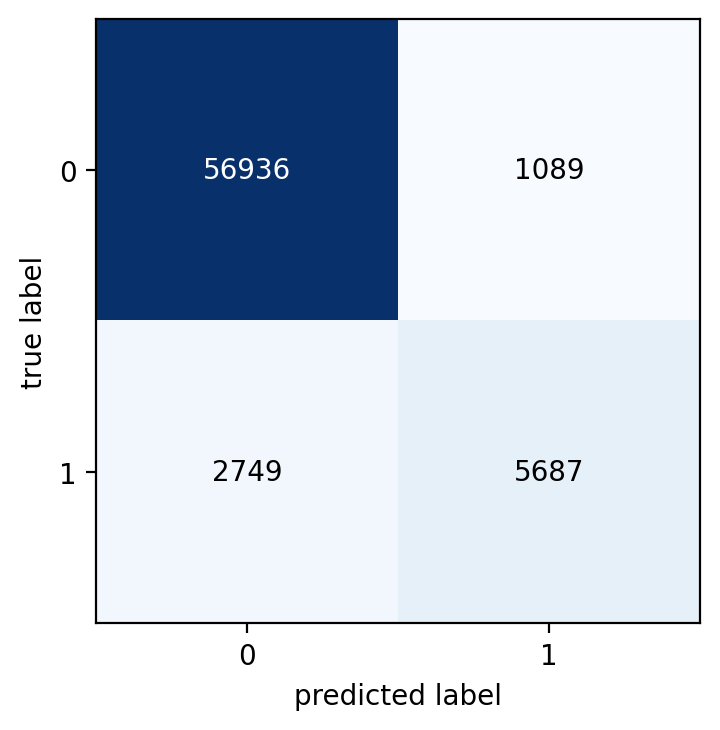
metrics.confusion_matrix(y_test, y_pred)
array([[56936,  1089],
       [ 2749,  5687]], dtype=int64)
Which is useful to be used for further processing. However, to take a look at a confusion matrix, I usually prefer more info there directly on the table (e.g. percentages, row and column totals -called support in scikit-learn terminology-).
So perhaps something like this?
pd.crosstab(y_test, y_pred, rownames=["Observed"],
            colnames=["Predicted"], margins=True)
Predicted      1     2    All
Observed
1          56936  1089  58025
2           2749  5687   8436
All        59685  6776  66461
Ok, a bit better. But percentages in addition to counts would be even better. And a visualization with colors and at least basic interactivity (e.g. tooltips) would be great. Is there something out there to do that with one line of code?
Well, googling a couple of minutes I found several alternatives.
Here’s an example using mlxtend
from mlxtend.plotting import plot_confusion_matrix
import matplotlib.pyplot as plt
import numpy as np

fig, ax = plot_confusion_matrix(
    conf_mat=metrics.confusion_matrix(y_test, y_pred),
    show_absolute=True,
    show_normed=False
)
plt.show()
fig, ax = plot_confusion_matrix(
    conf_mat=metrics.confusion_matrix(y_test, y_pred),
    show_absolute=True,
    show_normed=True
)
plt.show()
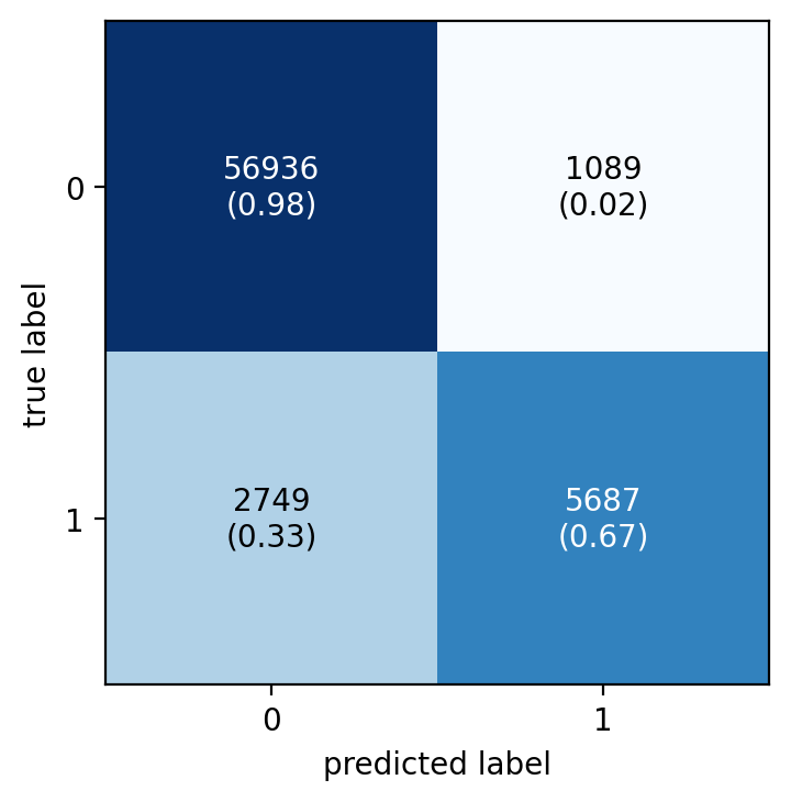
Much better. The first plot immediately reveals that there is an issue with imbalanced data and the need to take a look at a normalized confusion matrix. Then in the normalized matrix you can quickly spot that the model does not perform good for the low-frequency class. Out of the 8436 minority-class observations, the model correctly classifies only 5687 (‘67.4%') and a whooping ‘32.6%’ (2749 obs) were wrongly classified.
Classification report
It “builds a text report showing the main classification metrics”. The definition of the metrics is here. But in summary, intuitively: “Intuitively, precision is the ability of the classifier not to label as positive a sample that is negative, and recall is the ability of the classifier to find all the positive samples.”
- Precision is the percentage of correctly classified, for all those observations predicted in a class. (or the column percentage from the confusion matrix associated to correctly classified, not shown there, though). “tp / (tp + fp)”
- Recall is the percentage of correctly classified obs. within each class of observed values (or the row percentages of the confusion matrix associated to correctly classified, which is shown above in parethensis). “tp / (tp + fn)”
- fbeta-score is a weighted harmonic mean of precision and recall, where beta weights recall more than precision by a factor of beta. The default for beta is 1, so f1-score. Which beta would you choose in this example?
print(metrics.classification_report(y_test, y_pred))
              precision    recall  f1-score   support

           1       0.95      0.98      0.97     58025
           2       0.84      0.67      0.75      8436

    accuracy                           0.94     66461
   macro avg       0.90      0.83      0.86     66461
weighted avg       0.94      0.94      0.94     66461
There are a bunch of functions to individually obtain the metrics in the report above. For example:
metrics.precision_score(y_test, y_pred)
metrics.precision_score(y_test, y_pred, pos_label=2)
metrics.recall_score(y_test, y_pred)
metrics.recall_score(y_test, y_pred, pos_label=1)
metrics.recall_score(y_test, y_pred, pos_label=2)
metrics.f1_score(y_test, y_pred)
metrics.f1_score(y_test, y_pred, pos_label=2)
metrics.fbeta_score(y_test, y_pred, beta=0.01)
metrics.fbeta_score(y_test, y_pred, beta=0.5)
metrics.fbeta_score(y_test, y_pred, beta=0.01, pos_label=2)
metrics.fbeta_score(y_test, y_pred, beta=0.5, pos_label=2)
metrics.fbeta_score(y_test, y_pred, beta=1, pos_label=2)
# Since I care here more about recall over precision, perhaps beta=2 makes sense
metrics.fbeta_score(y_test, y_pred, beta=2, pos_label=2)
metrics.average_precision_score(y_test, y_pred)
metrics.precision_recall_fscore_support(y_test, y_pred, beta=1)
(array([0.95394153, 0.83928571]),
 array([0.98123223, 0.67413466]),
 array([0.96739444, 0.74769918]),
 array([58025,  8436], dtype=int64))
Hamming loss
This is the Hamming distance (# of obs that differ) between the observed and predicted, averaged (divided by the number of obs). Its sort of the counterpart of the accuracy score.
metrics.hamming_loss(y_test, y_pred)
0.057748153052165935
Matthews correlation coefficient
A correlation coefficient that ranges between -1 and 1. (1 means perfect prediction, 0 random prediction and -1 inverse prediction). It is pretty relevant for this case because it “is generally regarded as a balanced measure which can be used even if the classes are of very different sizes."
metrics.matthews_corrcoef(y_test, y_pred)
0.7210096175078716
Jaccard similarity coefficient score
From the documentation … “The Jaccard index [1], or Jaccard similarity coefficient, defined as the size of the intersection divided by the size of the union of two label sets, is used to compare set of predicted labels for a sample to the corresponding set of labels in y_true.”
metrics.jaccard_score(y_test, y_pred)
metrics.jaccard_score(y_test, y_pred, pos_label=2)
0.5970603674540682
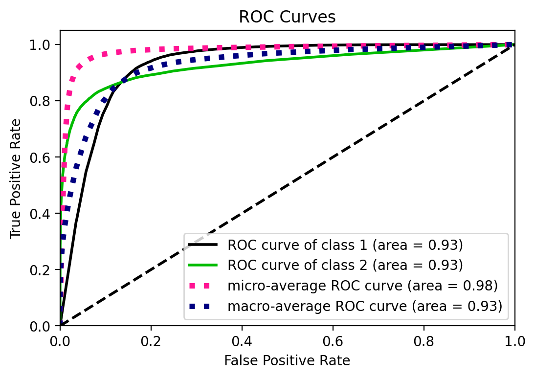
ROC curve and AUC
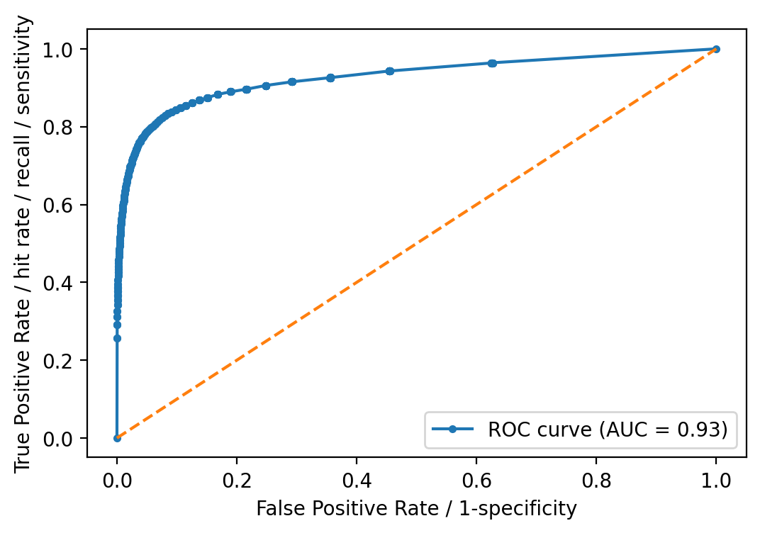
ROC curve and its AUC is well known in many fields and applications. I’d just
note here that it is designed to assess the performance of classifiers that
produce a probability or a score for every observation, and based on a
threshold, decides the classification. Decision Trees and Random Forests are,
in principle, discrete classifiers -i.e. predict the class label and not
necesarily a score- but they can be “converted” into score-classifiers
(see for example Fawcett, 2006). scikit-learn indeed provides a function
to predict probabilities instead of the class labels. predict_proba()
predicts class probabilities “computed as the mean predicted class probabilities
of the trees in the forest. The class probability of a single tree is the
fraction of samples of the same class in a leaf.”
# Need to predict probabilities instead of class labels directly for the ROC-AUC
y_prob = rforestclf.predict_proba(X_test)
y_prob = y_prob[:, 1]
fpr, tpr, thresholds = metrics.roc_curve(y_test, y_prob, pos_label=2)
auc = metrics.roc_auc_score(y_test, y_prob)
plt.plot(fpr, tpr, marker=".",
         label="ROC curve (AUC = %0.2f)" % auc)
plt.plot([0, 1], [0, 1], linestyle="--")
plt.legend(loc="lower right")
plt.xlabel("False Positive Rate / 1-specificity")
plt.ylabel("True Positive Rate / hit rate / recall / sensitivity")
plt.show()
UPDATE: I was not aware of scikitplot that provides convenient plotting
functionality for scikit-learn metrics and estimators.
# Note that here you do not have to select just one class like above
y_prob = rforestclf.predict_proba(X_test)
from scikitplot.metrics import plot_roc
fig, ax = plt.subplots()
plot_roc(y_test, y_prob, ax=ax) # you can customize it. get rid of microaverages
<matplotlib.axes._subplots.AxesSubplot at 0x26ed625a308>
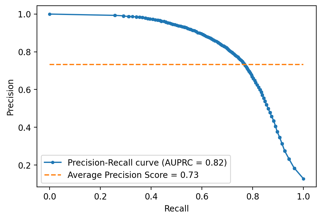
Precision Recall curve
Precision Recall curve is an alternative to ROC, which could be more appropriate
in cases of high class-imbalance -see for example Saito and Rehmsmeier (2015)-.
scikit-learn does not let you down here and provides functions for it.
y_prob = rforestclf.predict_proba(X_test)
y_prob = y_prob[:, 1]
precision, recall, threshold = metrics.precision_recall_curve(
    y_test, y_prob, pos_label=2
)
auprc = metrics.auc(recall, precision)
avg_precision = metrics.average_precision_score(y_test, y_prob)
plt.plot(recall, precision, marker=".",
         label="Precision-Recall curve (AUPRC = %0.2f)" % auprc)
plt.plot([0, 1], [avg_precision, avg_precision], linestyle="--",
         label="Average Precision Score = %0.2f" % avg_precision)
plt.legend(loc="lower left")
plt.xlabel("Recall")
plt.ylabel("Precision")
plt.show()
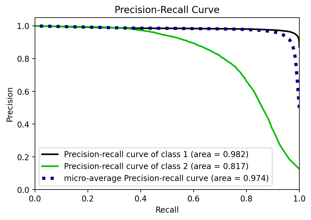
UPDATE: I was not aware of scikitplot that provides convenient plotting
functionality for scikit-learn metrics and estimators.
y_prob = rforestclf.predict_proba(X_test)
from scikitplot.metrics import plot_precision_recall
fig, ax = plt.subplots()
plot_precision_recall(y_test, y_prob, ax=ax)
<matplotlib.axes._subplots.AxesSubplot at 0x26ed53b1bc8>
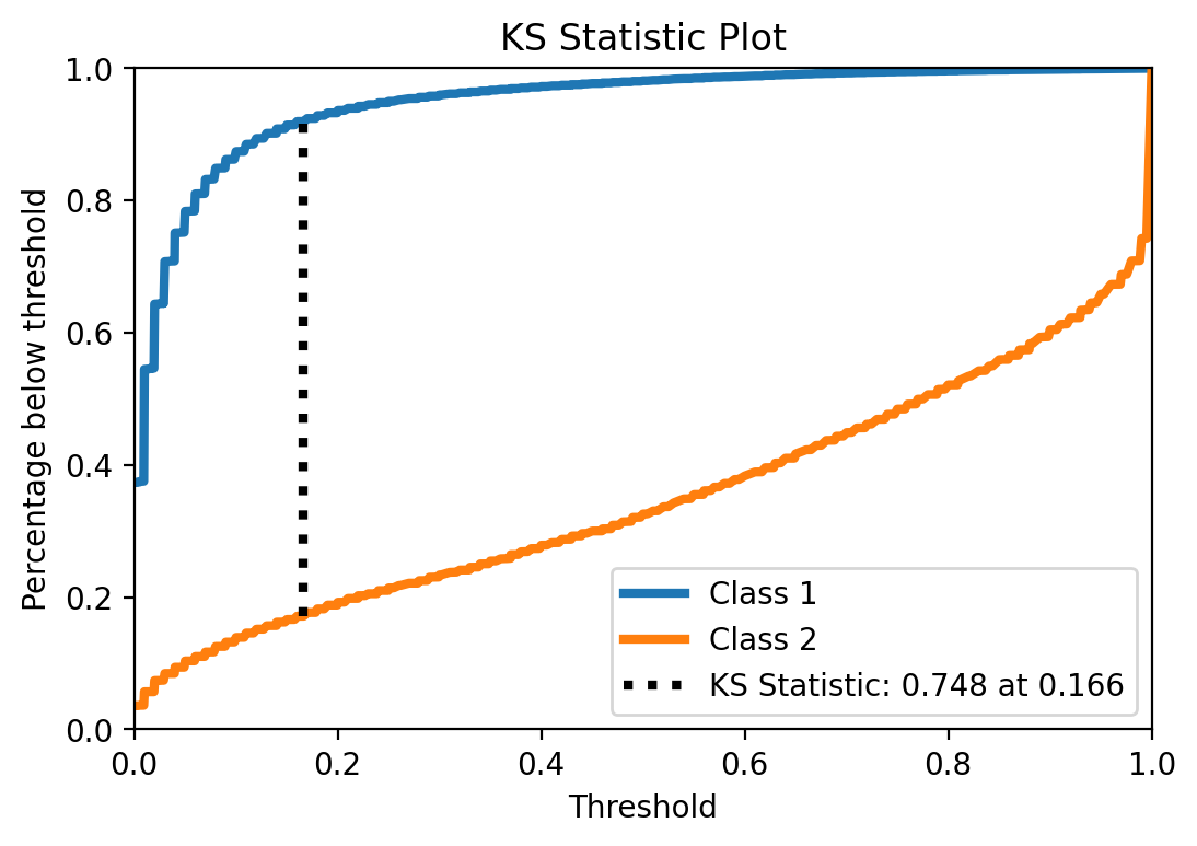
KS statistic
UPDATED to use scikitplot
Another interesting statistic to look at is KS and its plot. It indicates how good the predicted probabilities separate the classes. The point KS statistic correspond to the maximum difference between TPR and FPR, when you vary the classification threshold.
from scikitplot.metrics import plot_ks_statistic
plot_ks_statistic(y_test, y_prob)
<matplotlib.axes._subplots.AxesSubplot at 0x26ed5331048>
Interesting. The particular KS value is not that high, again, showing that the model is not that good. More interesting though is the pretty low threshold at which maximum difference ocurrs. So yeah, this is an indication that this might be one of the typical cases where using the default threshold may not be a good idea (not that using this KS-indicated specific threshold is also optimal, for many reasons, but one relevant reason for this example is that KS assumes the same importance for both classes, and here I might be more interested in class 2).
But anyway, out of curiosity let’s take a quick look and see what happens if I use this threshold.
y_prob = rforestclf.predict_proba(X_test)

from scikitplot.helpers import binary_ks_curve

thresholds, pct1, pct2, ks_statistic, max_distance_at, classes = binary_ks_curve(
    y_test, np.array(y_prob)[:, 1].ravel())

threshold = max_distance_at
y_pred_custom = np.ndarray(shape=y_prob[:,1].shape)
y_pred_custom[y_prob[:,1] >= threshold] = 2
y_pred_custom[y_prob[:,1] < threshold] = 1

fig, ax = plot_confusion_matrix(
    conf_mat=metrics.confusion_matrix(y_test, y_pred_custom),
    show_absolute=True,
    show_normed=True
)
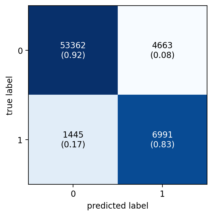
Cool, changing the threshold helps increasing considerably the recall, of course at the expense of precision. Later I see how this compares with other strategies to deal with this imbalanced data.
Calibration plot
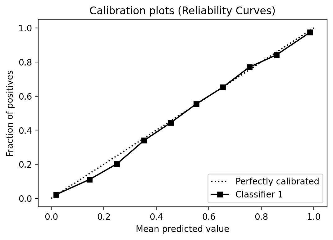
Alright, when one think about the threshold, one most probably think also about calibration. Decision-trees and Random Forests estimators usually provide well-calibrated scores. But let’s take a look anyway.
from scikitplot.metrics import plot_calibration_curve
plot_calibration_curve(y_test, [y_prob])
<matplotlib.axes._subplots.AxesSubplot at 0x26ed4cc5e48>
Cumulative gain plot
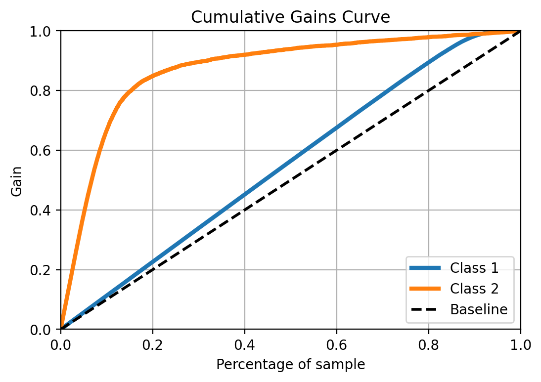
It shows how the fraction of true positives change, as you increase the percentage of the sample, previously ordered by the prediction score. So this is particularly useful when you what to prioritize based on the score/probability and how useful the model is to fo that.
from scikitplot.metrics import plot_cumulative_gain
plot_cumulative_gain(y_test, y_prob)
<matplotlib.axes._subplots.AxesSubplot at 0x26ed5378608>
Lift curve
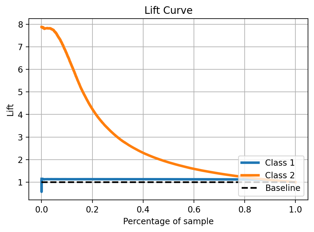
Similar to the cumulative gain plot, for the lift curve you need to order the observations based on the score, and the lift shows how much the model contributes on top of a no-predictive-model scenario.
from scikitplot.metrics import plot_lift_curve
plot_lift_curve(y_test, y_prob)
<matplotlib.axes._subplots.AxesSubplot at 0x26ed62c97c8>
Wrapping-up model evaluation
Good, above you have code examples for the most common evaluation metrics and a short description of them and their pros and cons. Just let me remember myself that sometimes may not be a good idea to rely only on one metric but rather analyze several metrics, always having in mind the issues of the case under study (like the imbalance in this case).
Having seen model evaluation metrics, there are at least three issues to deal with:
- Check feature importance in the model
- Take a deep look into performance of the model, in particular, considering imbalanced data.
- Some feature pre-processing, in particular, correctly handling categorical variables because for most variables in this dataset it makes no sense at all to use them as numerical predictors. (two expected challenges: it would take longer to fit the model and let’s see how scikit learn handles feature importance for categorical variables passed to the model for example as dummy variables -one hot encoding in scikit terminology-. I have used for example H2O’s implementation and it can nicely handle such cases)
So those are issues to deal with in other posts.
Session Info
from sinfo import sinfo
from IPython.display import display_markdown
sinfo_html = sinfo(html=True, write_req_file=False)
display_markdown(sinfo_html.data, raw=True)
Click to view module versions
-----
eli5        0.10.1
joypy       0.2.2
matplotlib  3.2.1
mlxtend     0.17.2
numpy       1.18.1
pandas      1.0.3
pytictoc    1.4.0
scikitplot  0.3.7
seaborn     0.10.0
sinfo       0.3.1
sklearn     0.22.2.post1
-----
Click to view dependency modules
attr                19.3.0
backcall            0.1.0
colorama            0.4.3
concurrent          NA
cycler              0.10.0
cython_runtime      NA
dateutil            2.8.1
decorator           4.4.2
defusedxml          0.6.0
eli5                0.10.1
encodings           NA
entrypoints         0.3
genericpath         NA
graphviz            0.13.2
importlib_metadata  1.6.0
ipykernel           5.2.0
ipython_genutils    0.2.0
ipywidgets          7.5.1
jedi                0.15.2
jinja2              2.11.1
joblib              0.14.1
joypy               0.2.2
jsonschema          3.2.0
kiwisolver          1.2.0
markupsafe          1.1.1
matplotlib          3.2.1
mistune             0.8.4
mlxtend             0.17.2
mpl_toolkits        NA
nbconvert           5.6.1
nbformat            5.0.4
nt                  NA
ntpath              NA
nturl2path          NA
numpy               1.18.1
opcode              NA
pandas              1.0.3
pandocfilters       NA
parso               0.6.2
pickleshare         0.7.5
posixpath           NA
prompt_toolkit      3.0.5
pvectorc            NA
pweave              0.30.3
pydoc_data          NA
pyexpat             NA
pygments            2.6.1
pyparsing           2.4.7
pyrsistent          NA
pytz                2019.3
scikitplot          0.3.7
scipy               1.3.1
seaborn             0.10.0
sinfo               0.3.1
six                 1.14.0
sklearn             0.22.2.post1
sre_compile         NA
sre_constants       NA
sre_parse           NA
statsmodels         0.11.1
testpath            0.4.4
tornado             6.0.4
traitlets           4.3.3
wcwidth             NA
zipp                NA
zmq                 19.0.0
-----
IPython             7.13.0
jupyter_client      6.1.2
jupyter_core        4.6.3
notebook            6.0.3
-----
Python 3.7.6 | packaged by conda-forge | (default, Mar 23 2020, 22:22:21) [MSC v.1916 64 bit (AMD64)]
Windows-10-10.0.18362-SP0
4 logical CPU cores, Intel64 Family 6 Model 142 Stepping 9, GenuineIntel
-----
Session information updated at 2020-04-14 16:42
